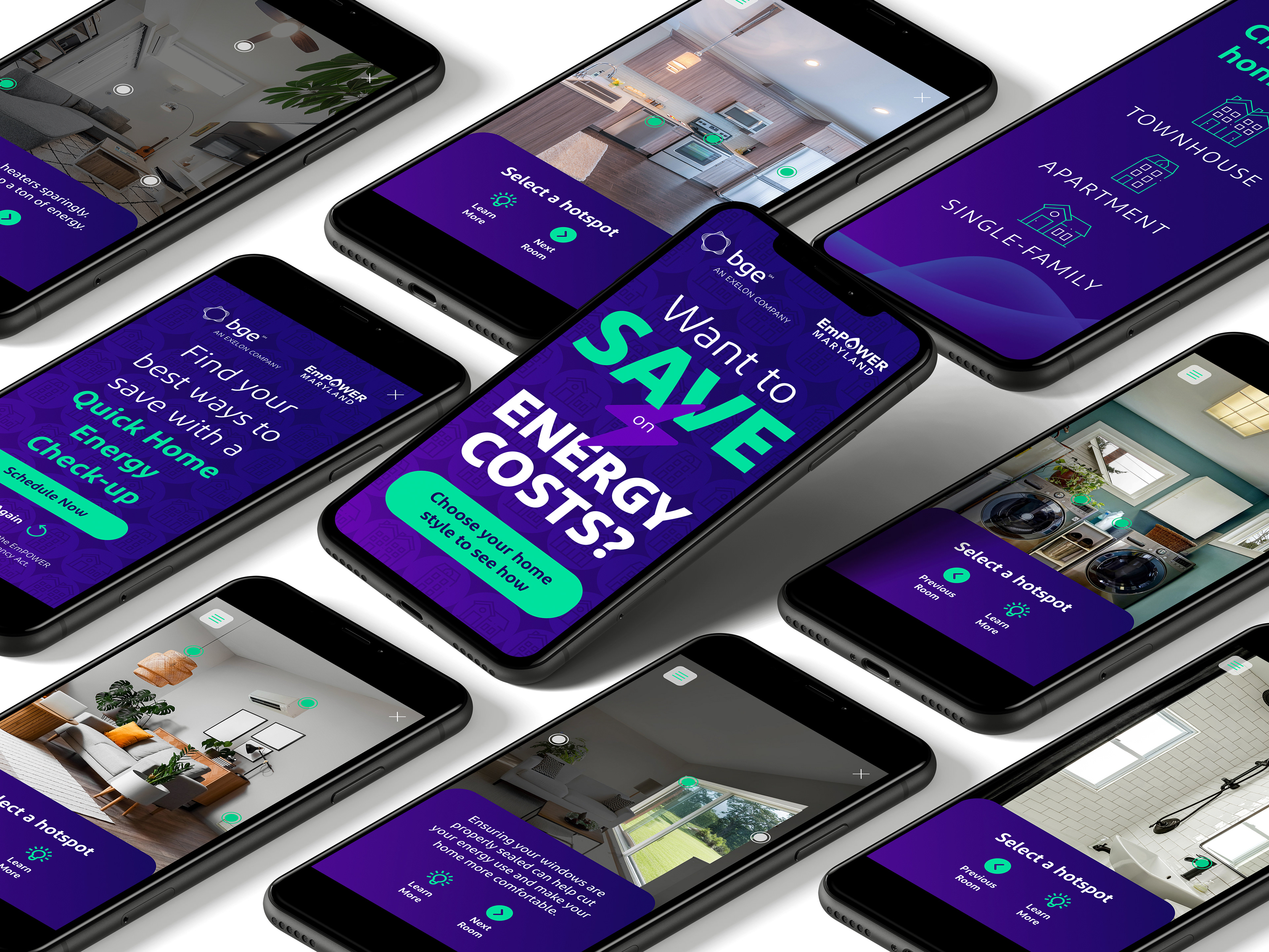
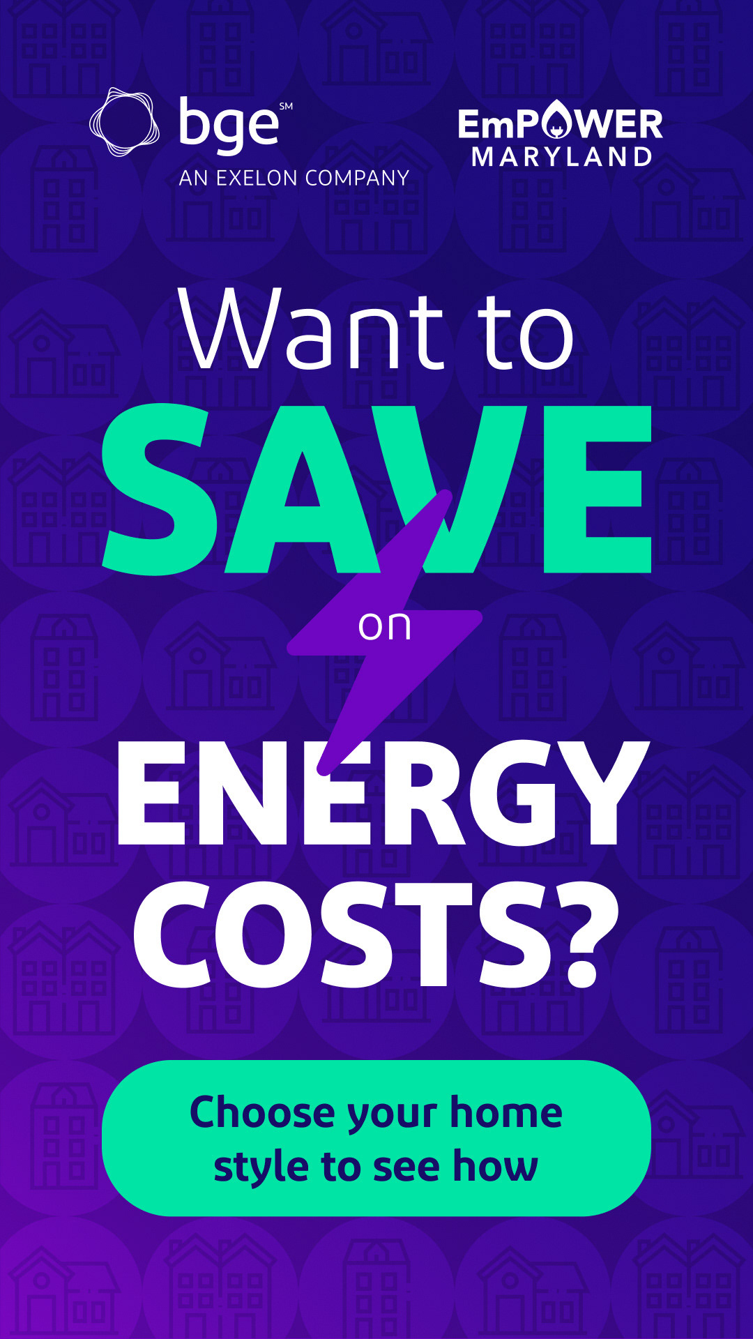
Product: Interactive digital ad that lets users choose their home type (apartment, townhome, single-family) then tap hotspots on appliances to learn energy-saving tips and rebates.
Client: Baltimore Gas & Electric (utility provider).
Role: Lead UI/UX designer and prototype developer (Figma + AI tools).
Team: Solo designer with rotating input from BGE’s digital marketing and analytics team.
Timeline: ~5 weeks.
Tools: Figma for wireframing and prototyping, Photoshop/AI for image manipulation, custom HTML/CSS prototype for interaction testing.
The Problem
BGE needed a dynamic, engaging ad that caters to different home configurations and
lets users self-navigate energy-saving advice relevant to their household—while ensuring
no path leads to a dead end and everyone can reach the CTA at any moment.
lets users self-navigate energy-saving advice relevant to their household—while ensuring
no path leads to a dead end and everyone can reach the CTA at any moment.
Goals & Objectives
Allow users to choose their home type and explore applicable appliances or systems.
Communicate energy-saving tips clearly and contextually.
Maintain a seamless, non-linear navigation where users can always return to CTA.
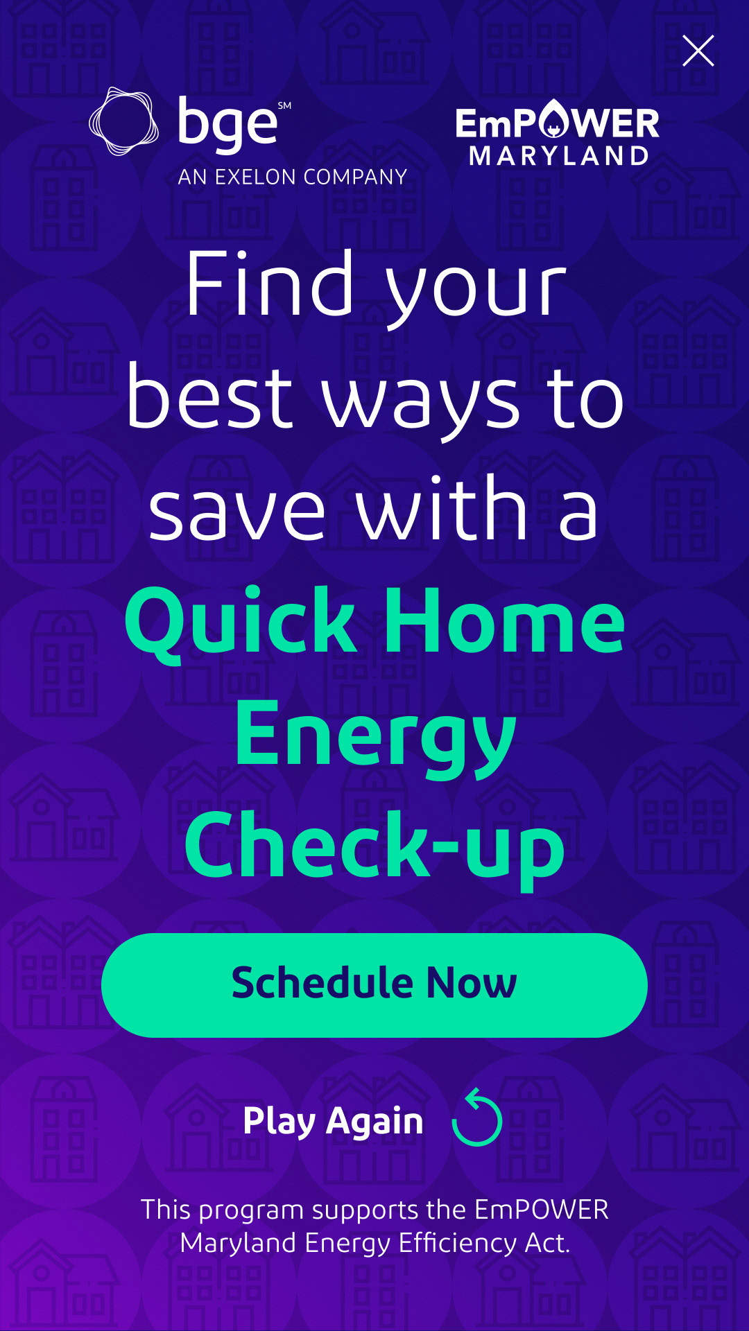
Showcase BGE’s rebates and services in a friendly, empowering way.
Communicate energy-saving tips clearly and contextually.
Maintain a seamless, non-linear navigation where users can always return to CTA.
Showcase BGE’s rebates and services in a friendly, empowering way.
UX Process
Discovery / Research
Reviewed ad analytics: previous campaigns had low engagement due to one-size-fits-all messaging.
Surveyed current BGE customers: homeowners want targeted, relevant content.
Explored non-linear interactive experiences—hotspot-based learning resonated best.
Reviewed ad analytics: previous campaigns had low engagement due to one-size-fits-all messaging.
Surveyed current BGE customers: homeowners want targeted, relevant content.
Explored non-linear interactive experiences—hotspot-based learning resonated best.
Define
Insight: users need a flexible way to explore options one at a time, and should never feel stuck.
How Might We: create a universal structure that accommodates any journey to the CTA?
Insight: users need a flexible way to explore options one at a time, and should never feel stuck.
How Might We: create a universal structure that accommodates any journey to the CTA?
Ideation
Whiteboarded map of potential user journeys across three home types.
Sketched UI layouts: home-type selector, central hotspot panel, dynamic panels for tips, exit-to-CTA button always visible.
Whiteboarded map of potential user journeys across three home types.
Sketched UI layouts: home-type selector, central hotspot panel, dynamic panels for tips, exit-to-CTA button always visible.
Wireframes
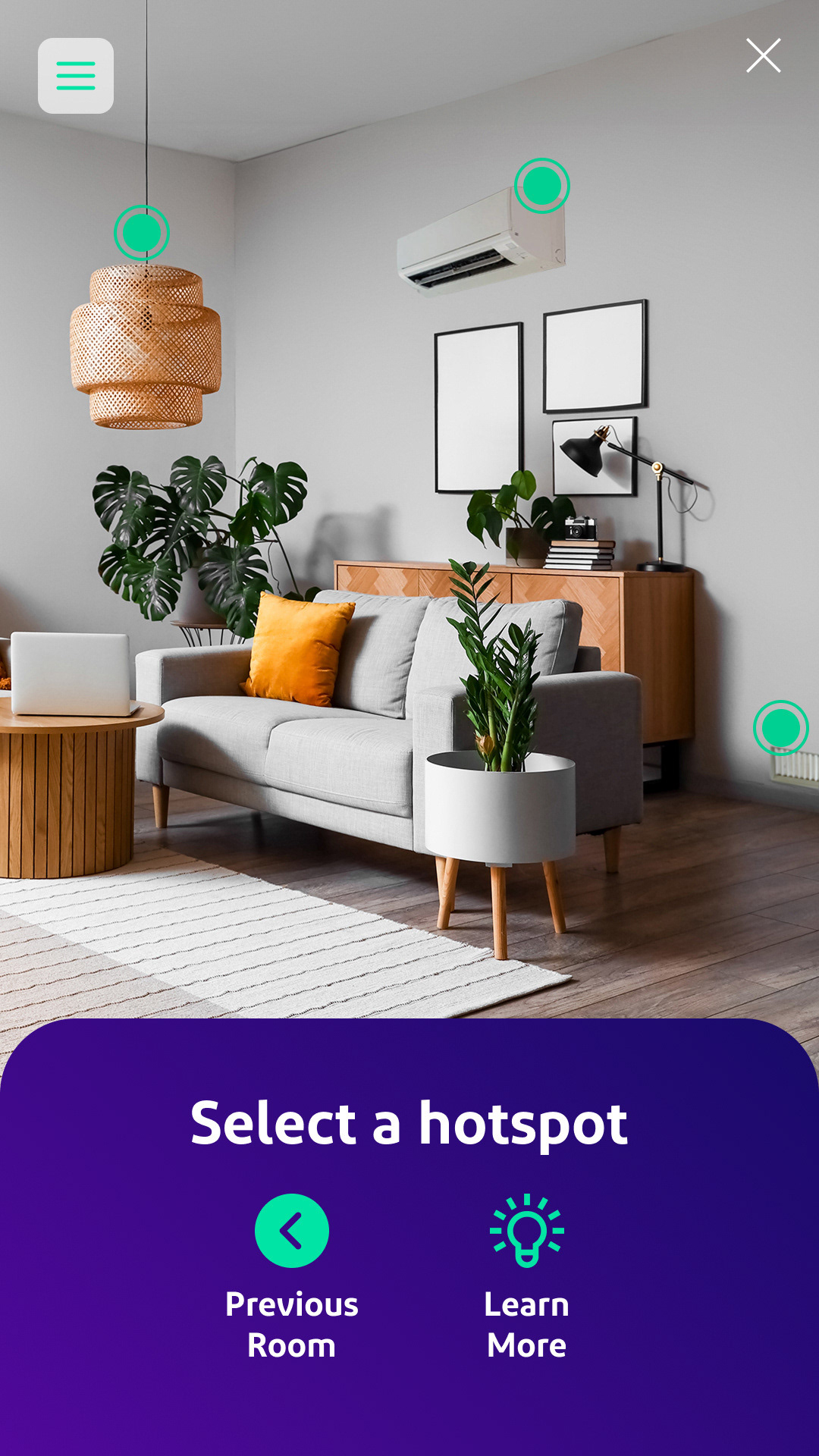
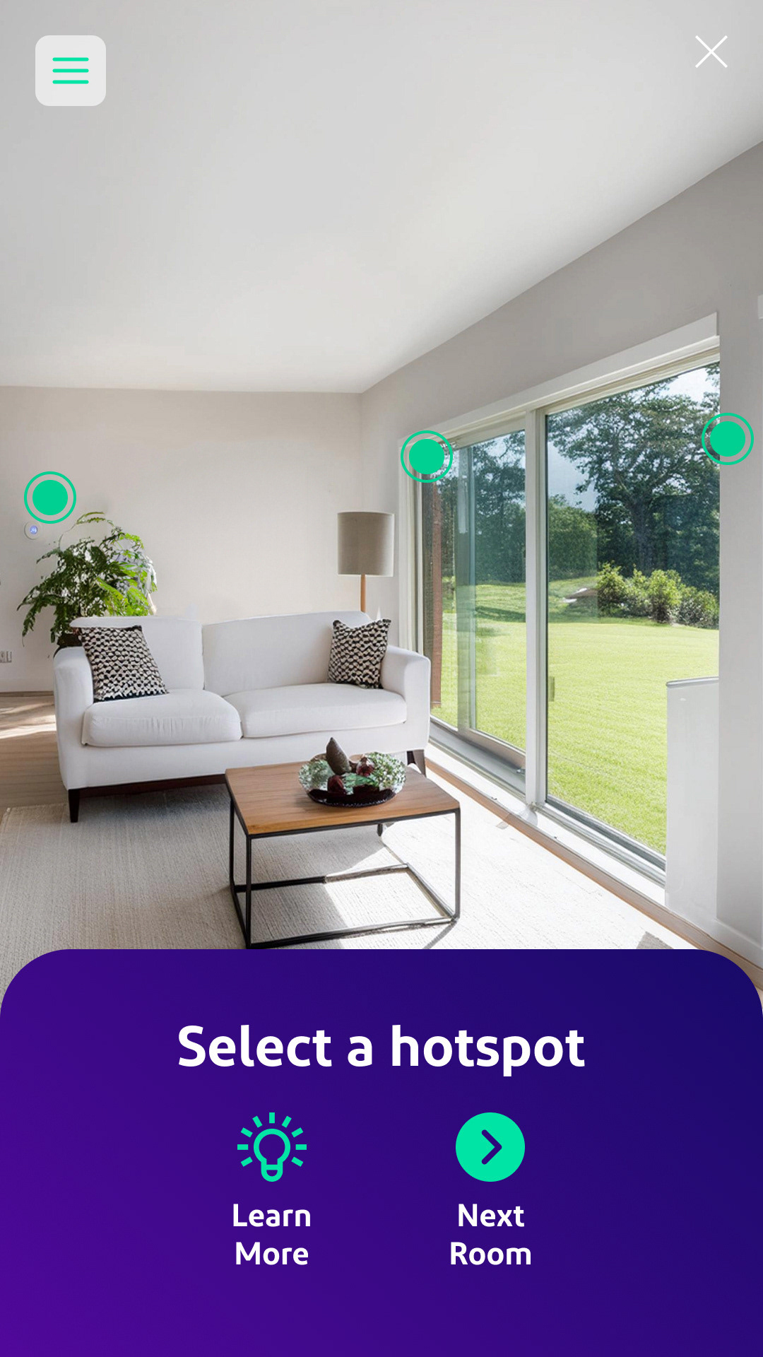
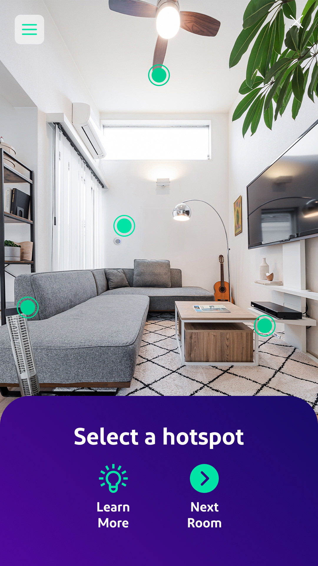
Low-fidelity flows built in Figma:
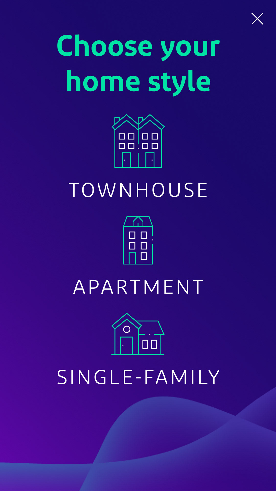
Welcome screen (select home type)
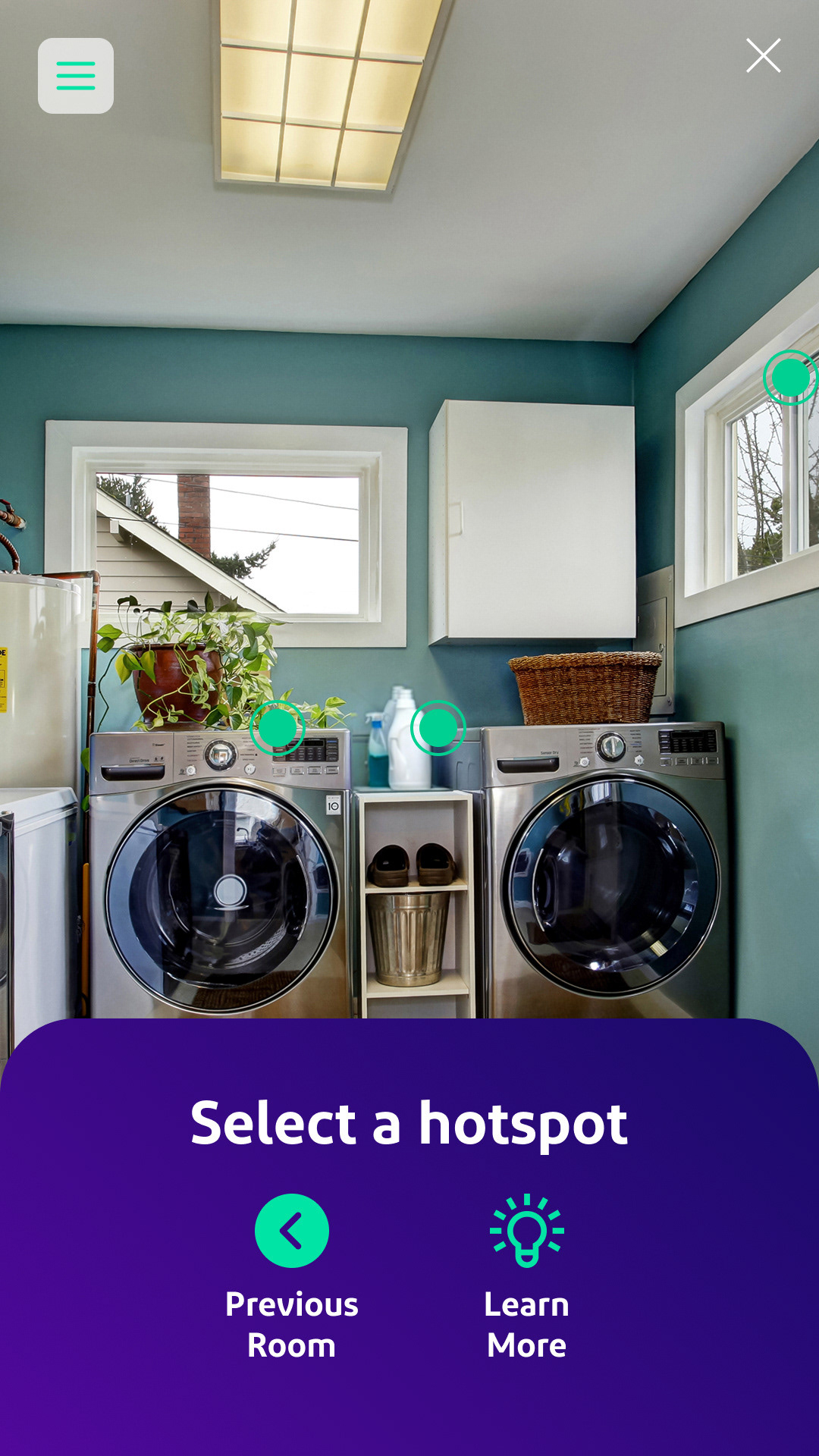
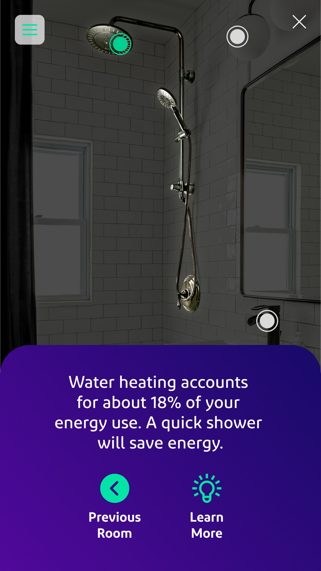
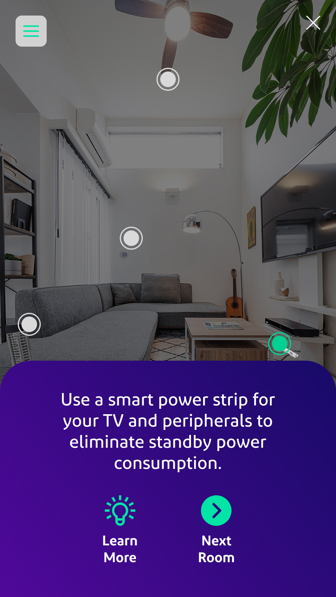
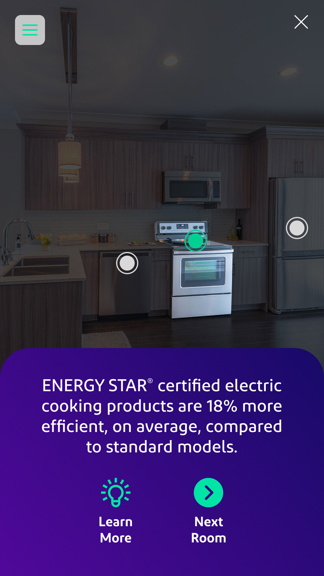
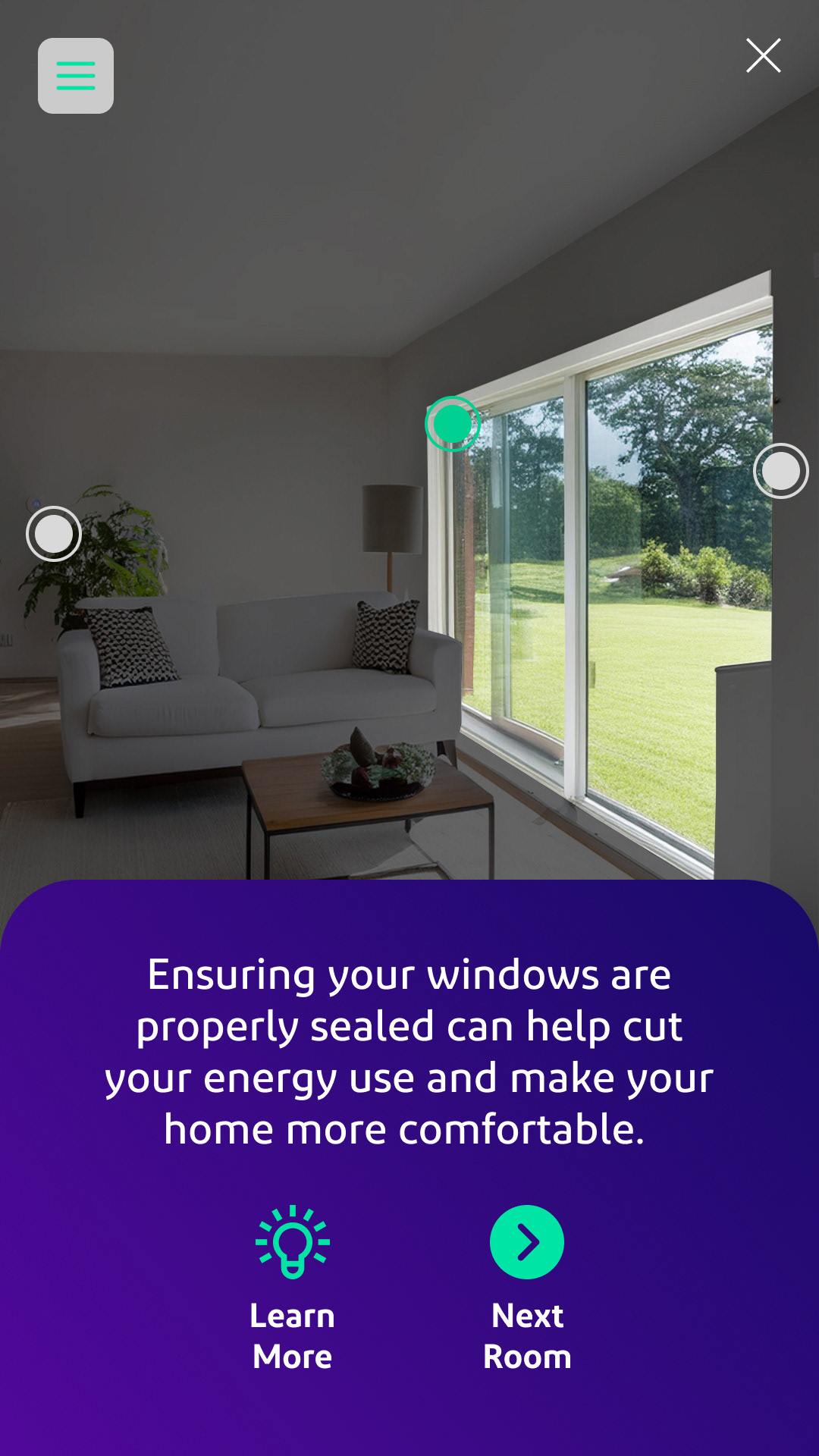
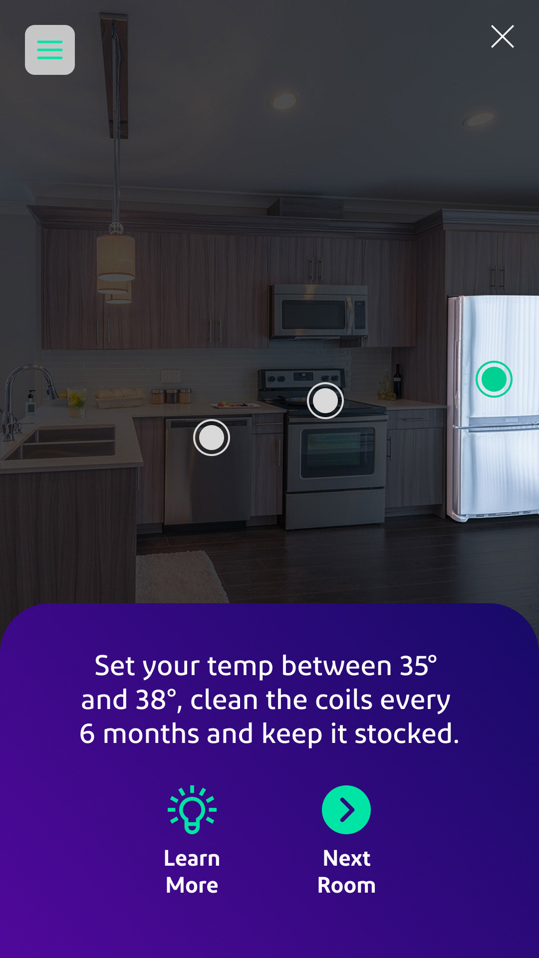
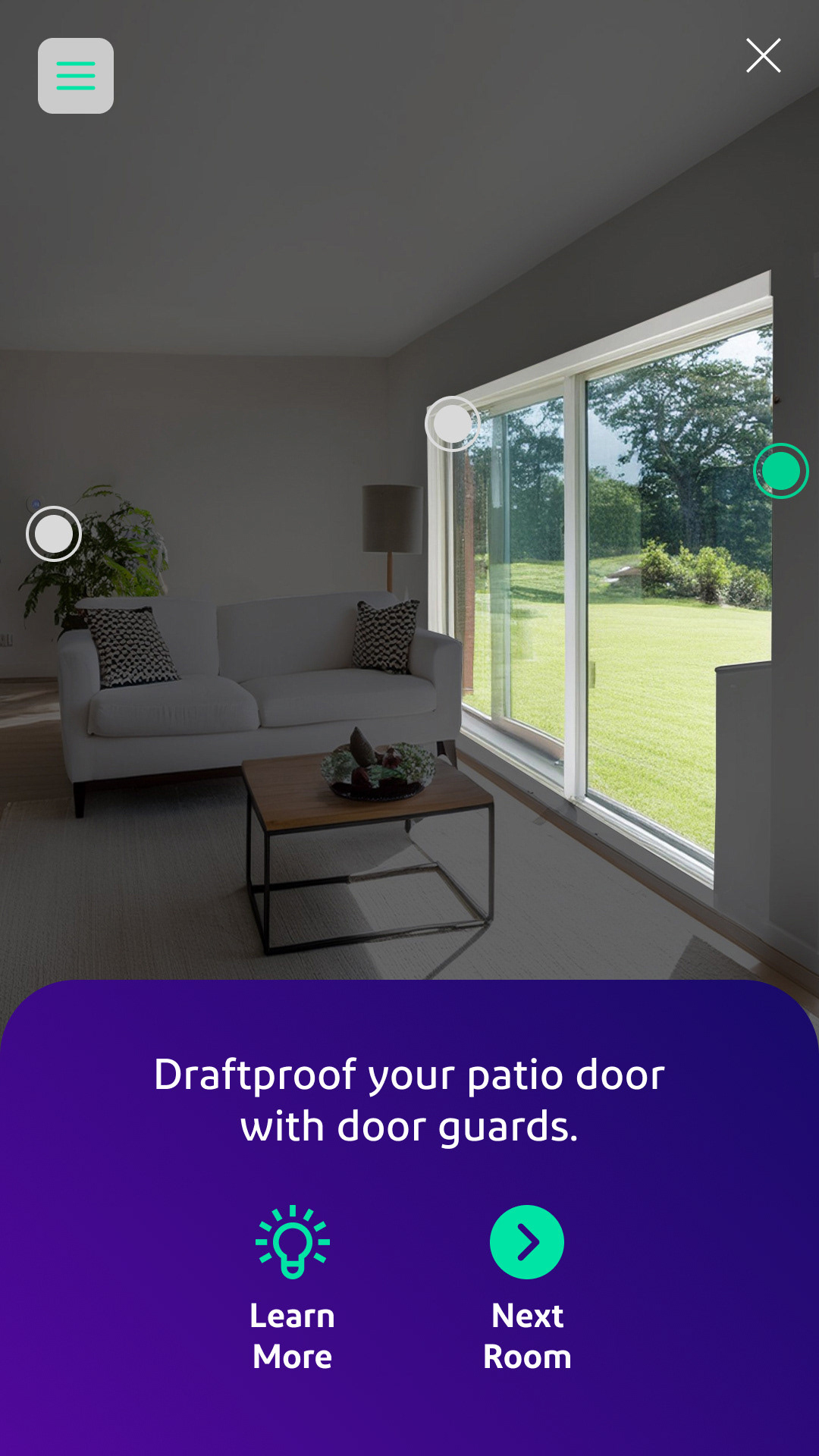
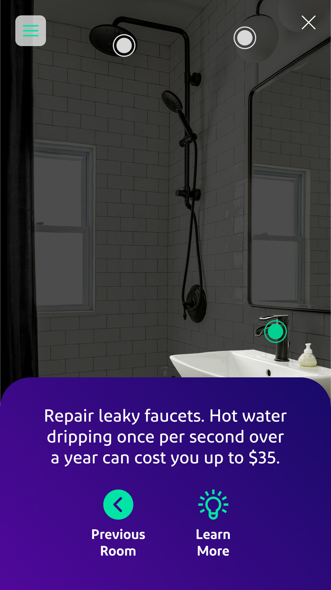
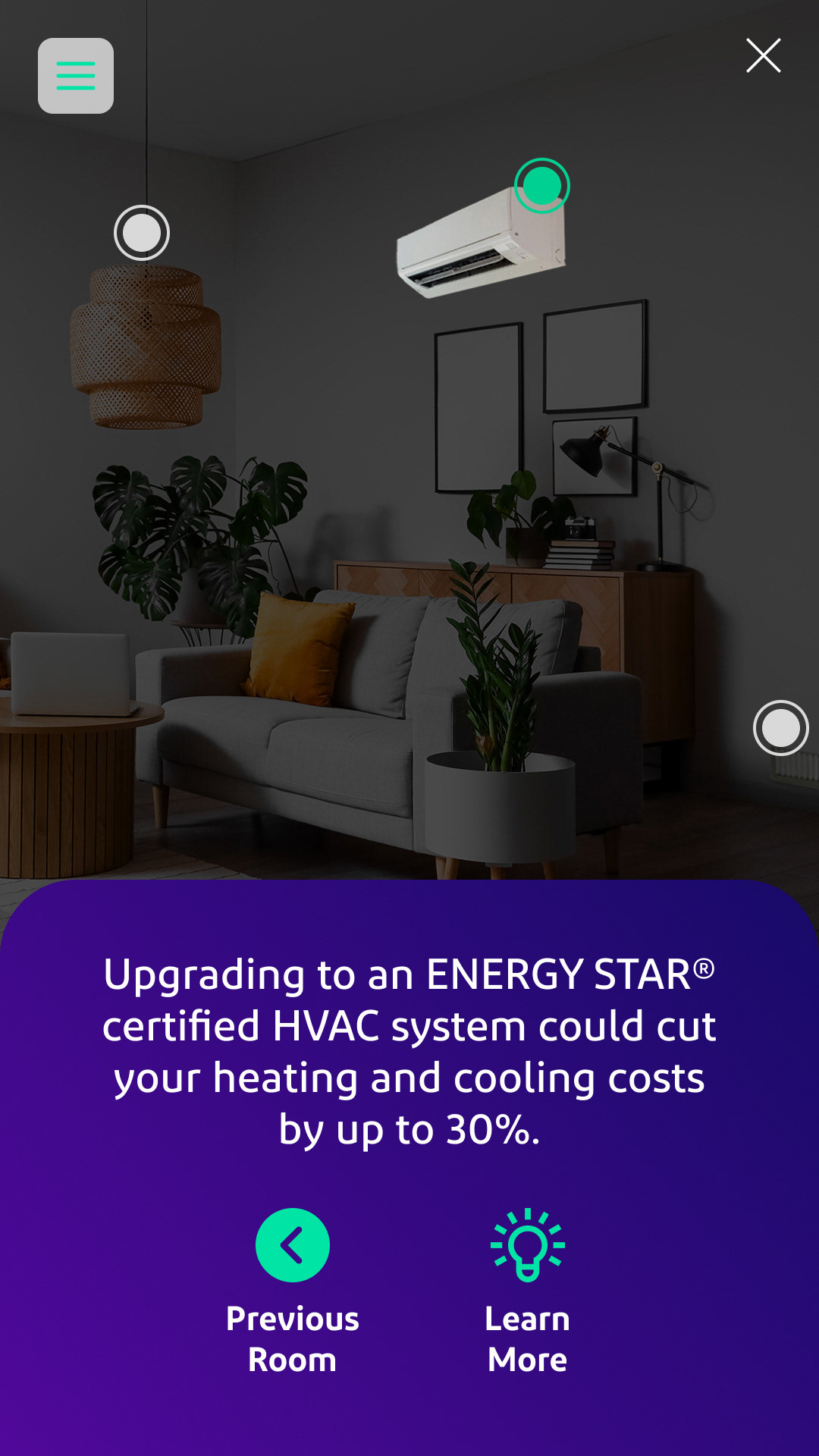
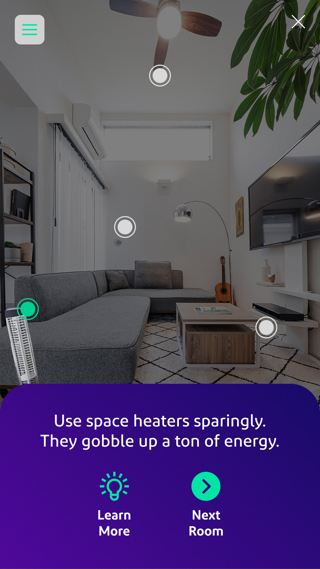
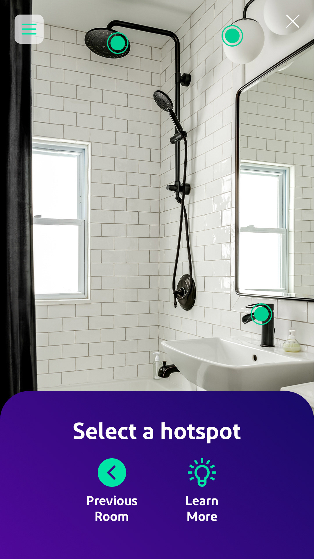
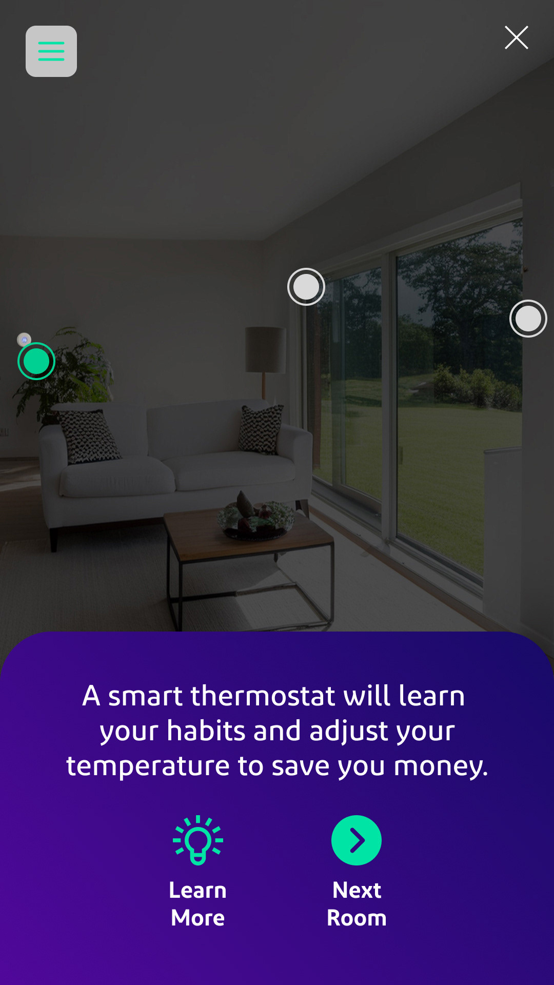
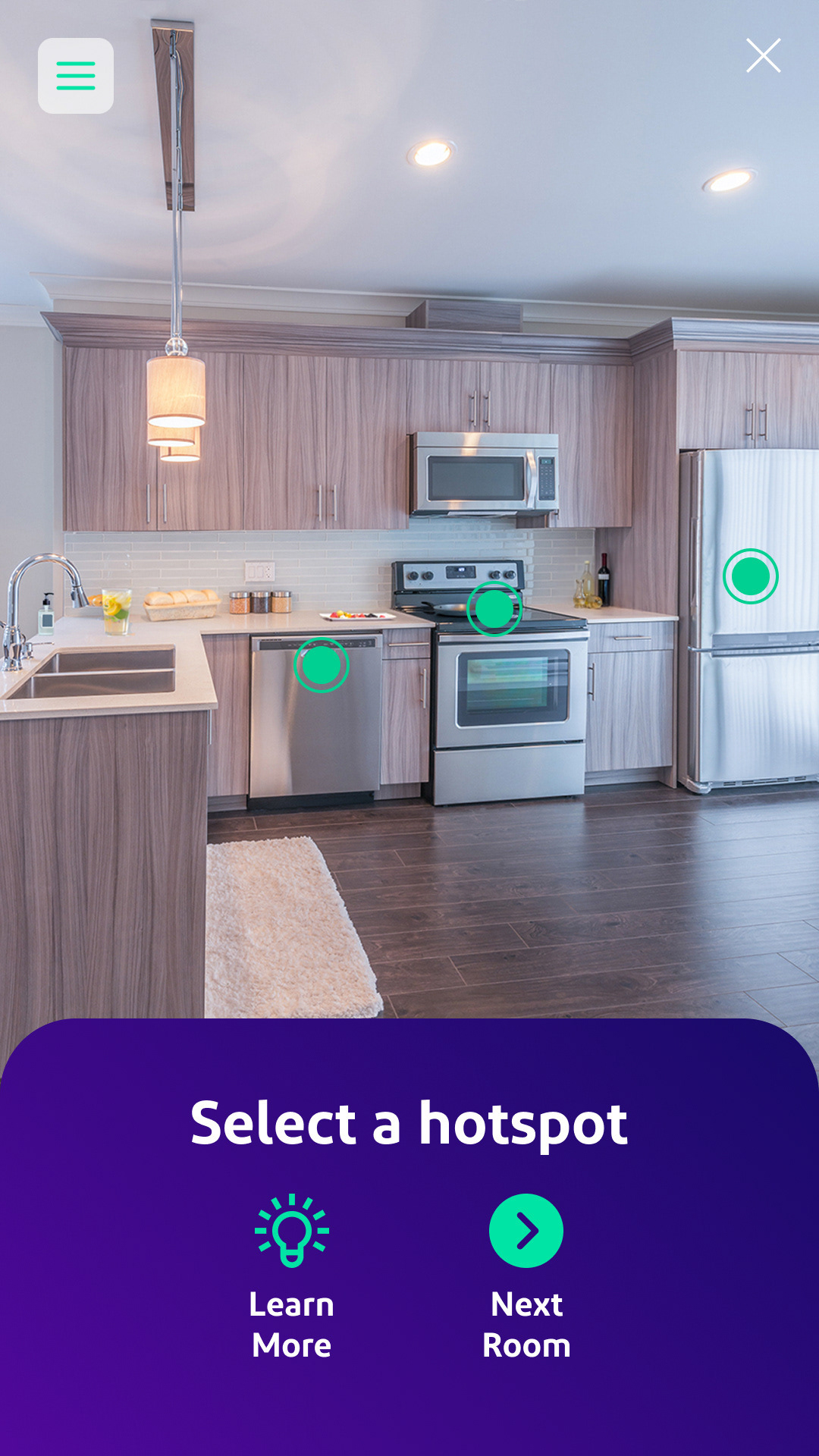
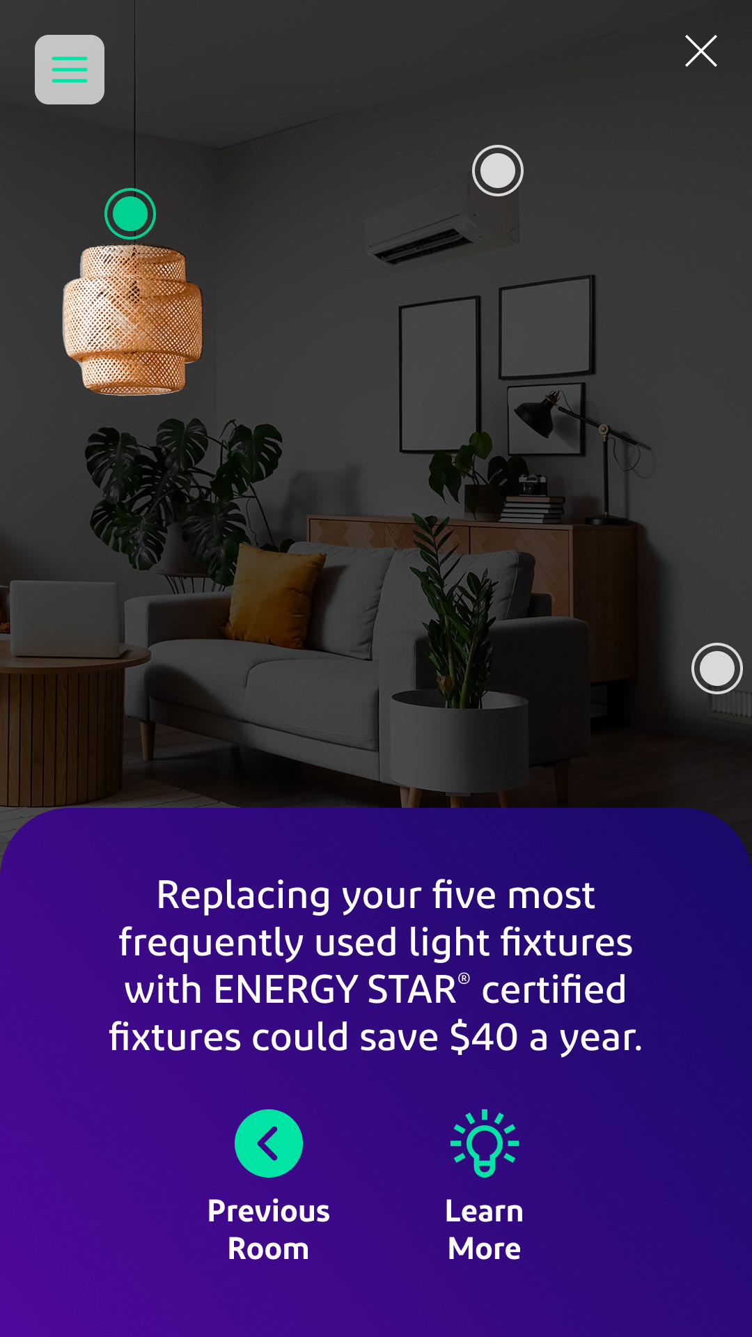
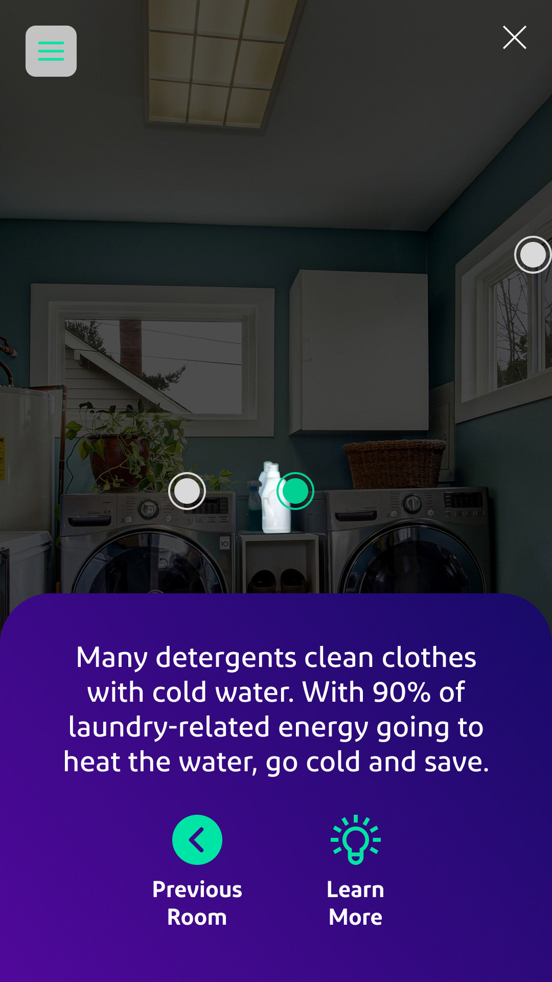
Interactive “control panel” overlay
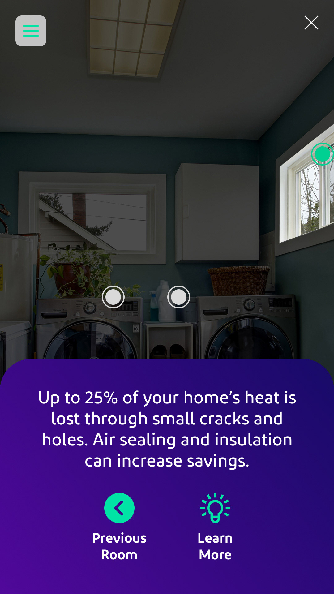
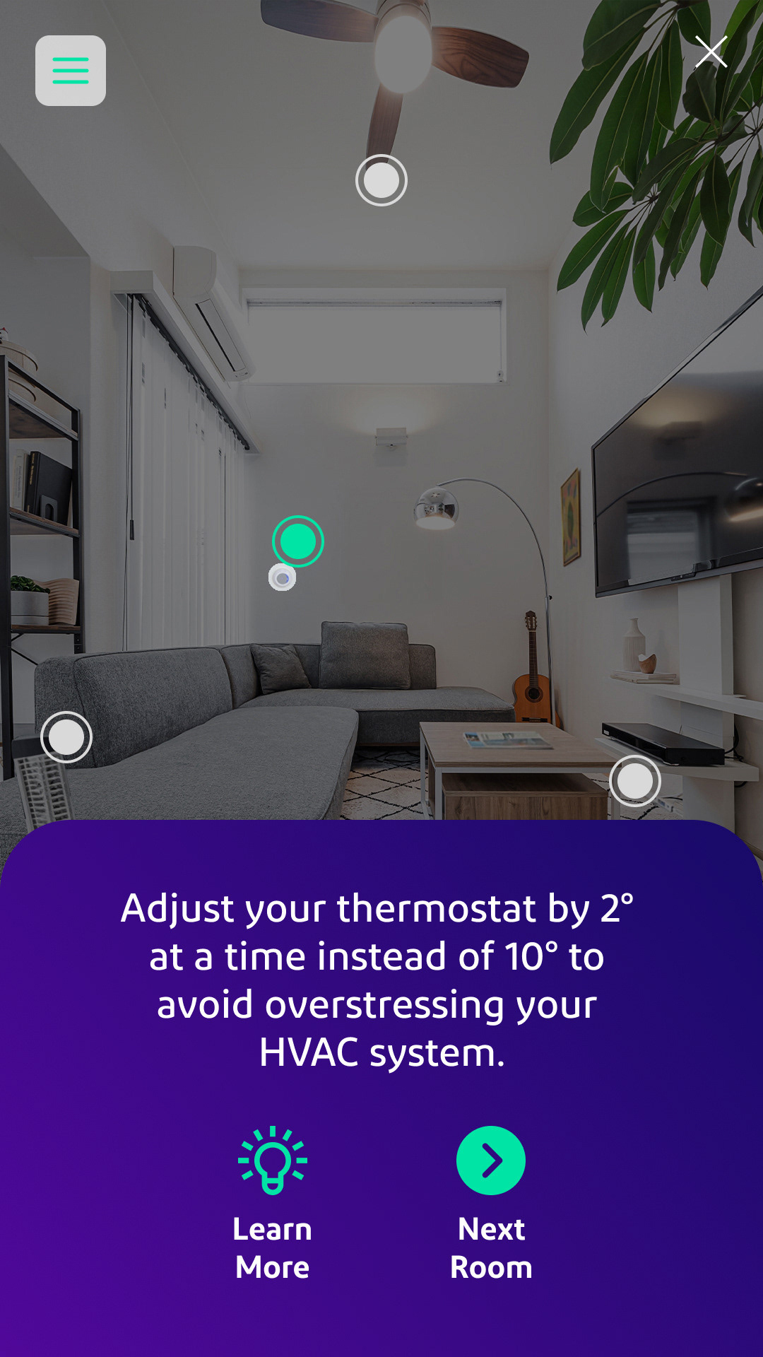
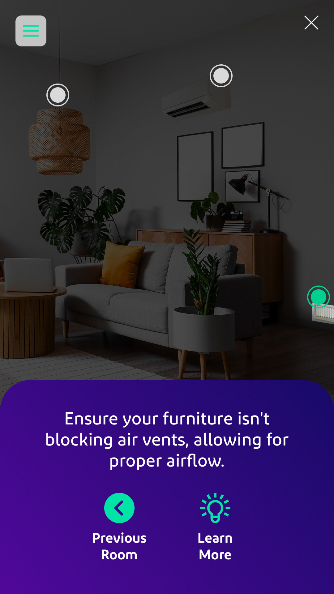
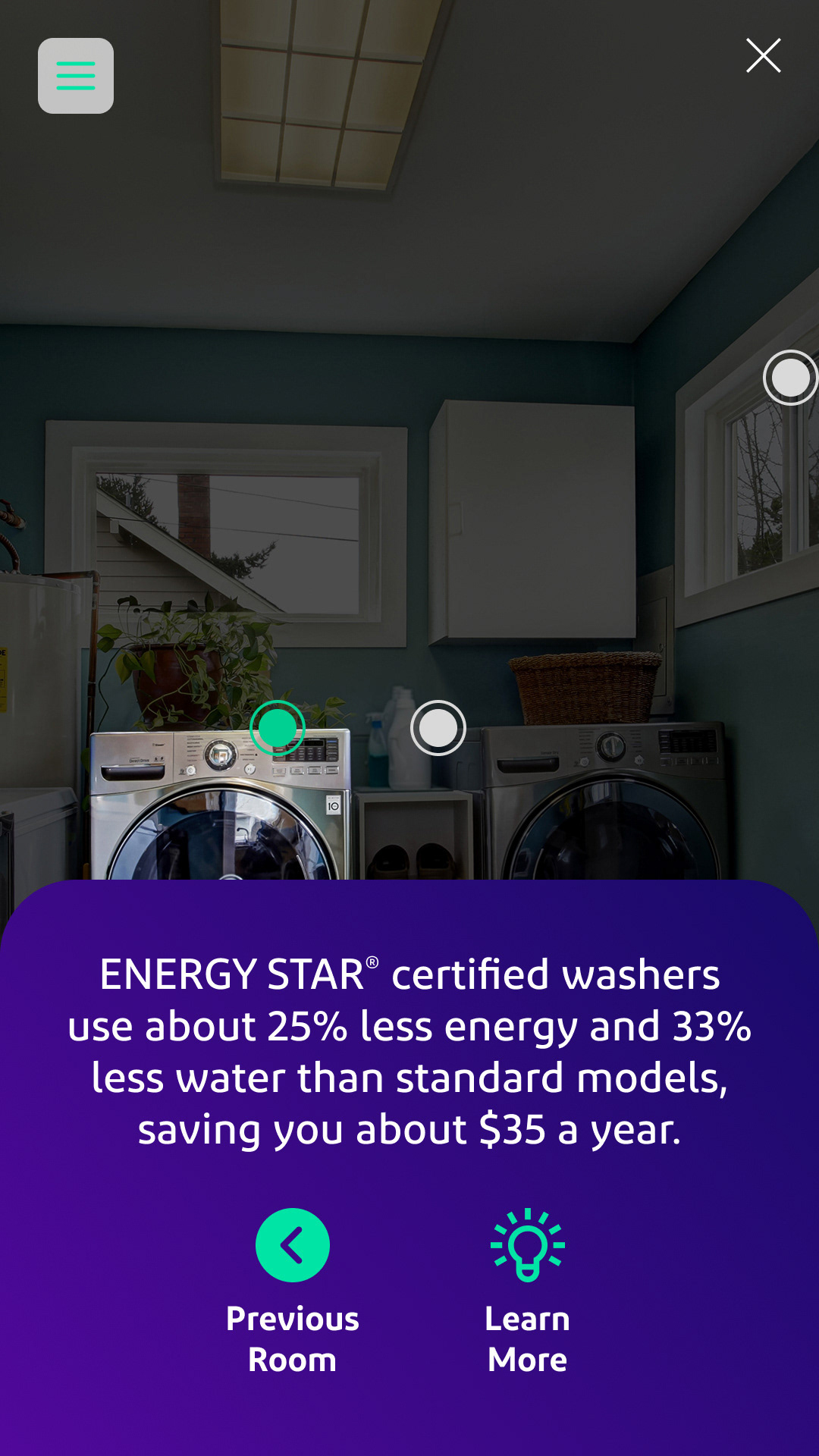
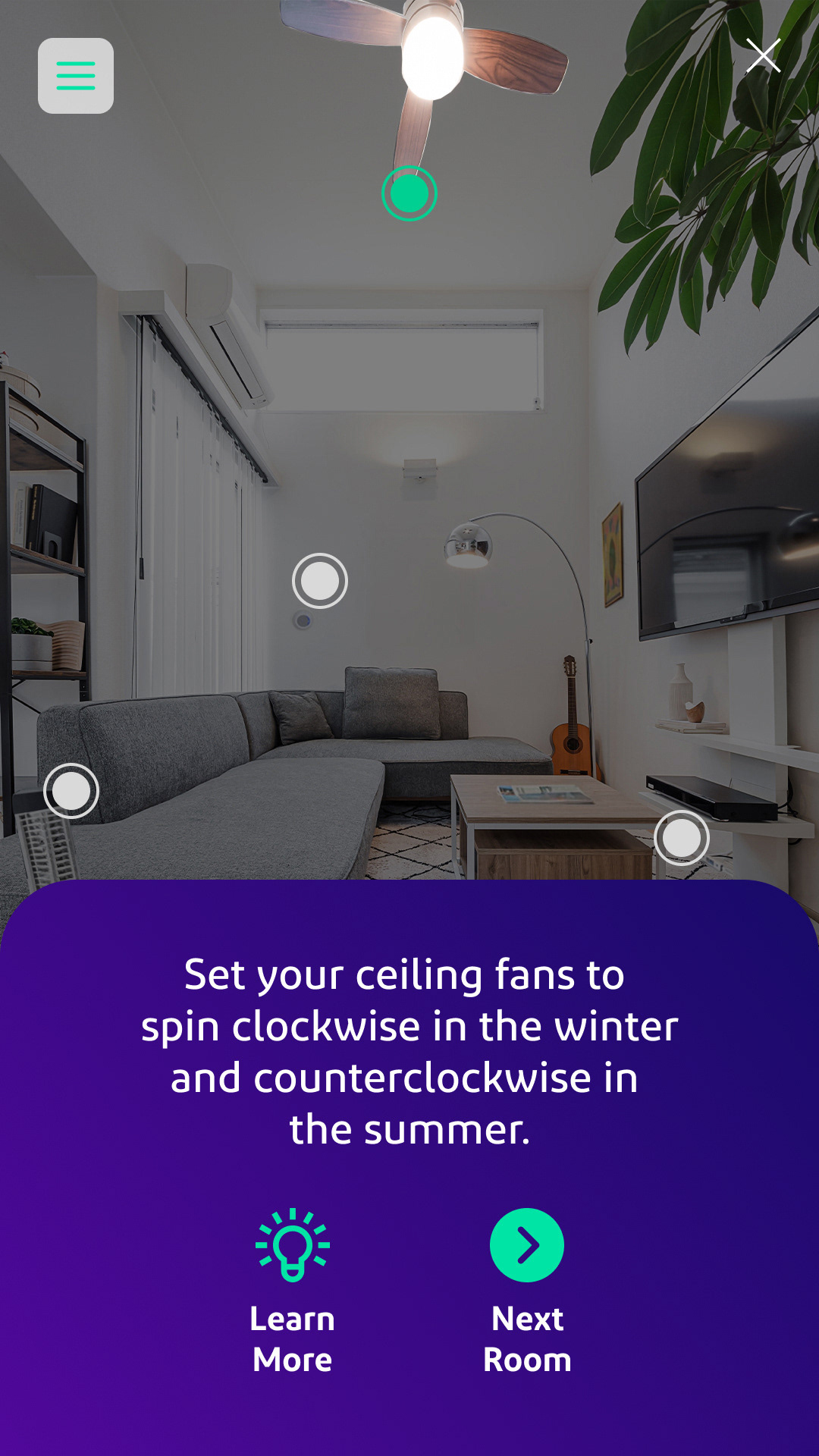
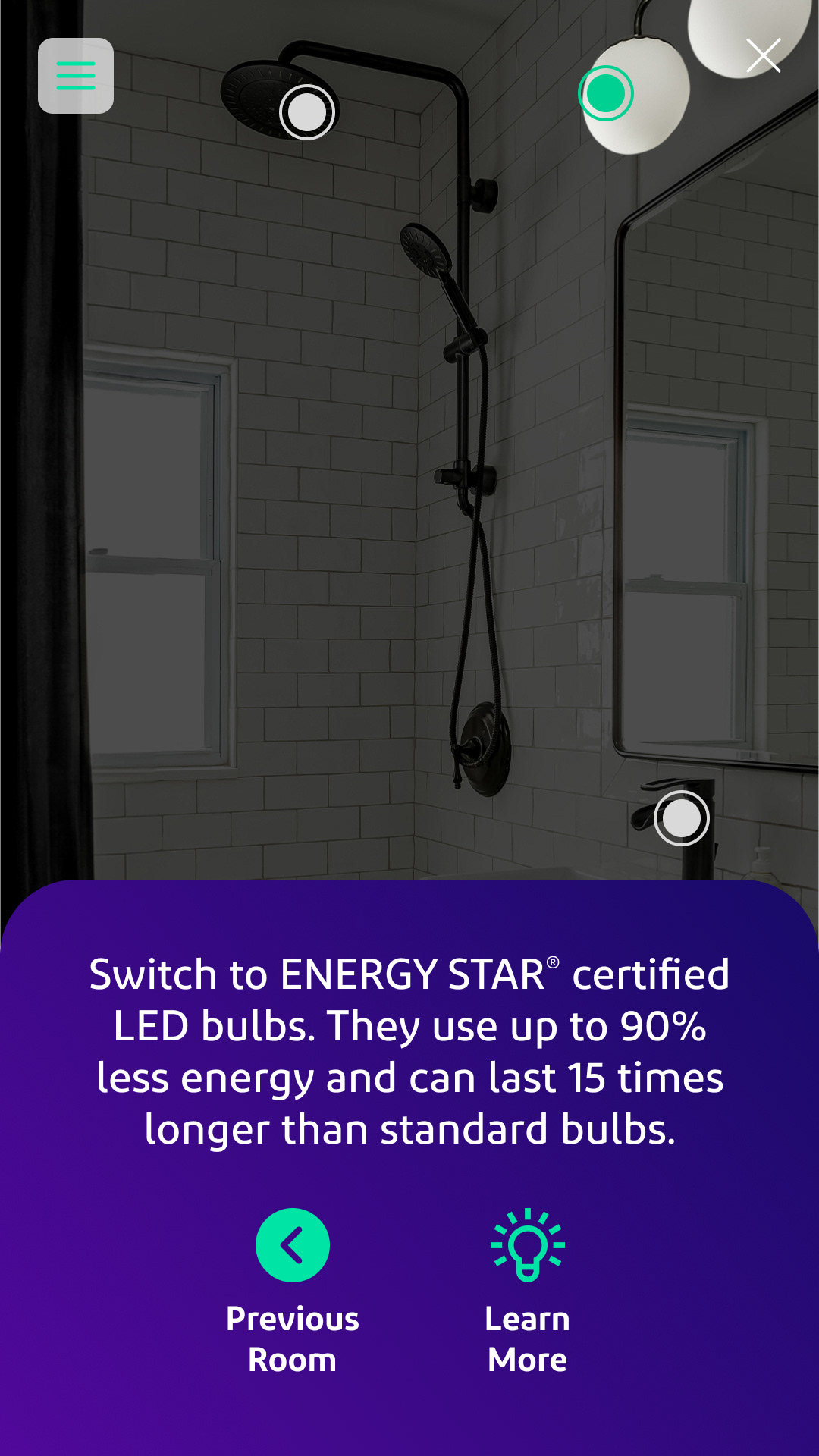
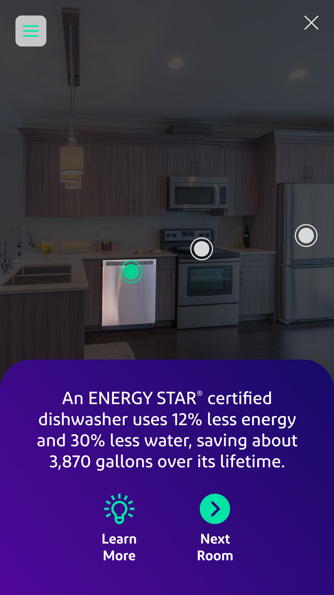
Hotspot panels appear on hover/tap, with images and tips
Global footer containing exit button/CTA link
Low-fidelity flows built in Figma:
Welcome screen (select home type)
Interactive “control panel” overlay
Hotspot panels appear on hover/tap, with images and tips
Global footer containing exit button/CTA link
Prototyping
Built high-fidelity interactive prototype using Figma with overlays and dynamic components.
Used AI tools to generate appliances composited into stock home images for a consistent visual feel.
Designed a minimalistic interface panel to manage navigation and context clues.
Built high-fidelity interactive prototype using Figma with overlays and dynamic components.
Used AI tools to generate appliances composited into stock home images for a consistent visual feel.
Designed a minimalistic interface panel to manage navigation and context clues.
Testing & Feedback
Usability tests (10 users per home type):
95% found at least three tips in under 30 seconds.
All users recognized how to exit to the CTA at all times.
Several users suggested a progress indicator to show explored tips.
Usability tests (10 users per home type):
95% found at least three tips in under 30 seconds.
All users recognized how to exit to the CTA at all times.
Several users suggested a progress indicator to show explored tips.
Iterations
Added tooltip on control panel explaining “tap hotspots for tips.”
Introduced feedback animations to reinforce interactions.
Progress dot indicator added near CTA to show tip count.
Added tooltip on control panel explaining “tap hotspots for tips.”
Introduced feedback animations to reinforce interactions.
Progress dot indicator added near CTA to show tip count.
Outcome/Results
Engagement: Prototype user completion rate ~85%; average hotspot taps per session: 3.8.
Perception: Test participants reported ad felt “fun,” “smart,” and “helped me learn.”
Next Steps: BGE plans an A/B test with the live ad, measuring actual click-through to rebate landing pages.
Perception: Test participants reported ad felt “fun,” “smart,” and “helped me learn.”
Next Steps: BGE plans an A/B test with the live ad, measuring actual click-through to rebate landing pages.
Challenges & Reflections
Non-linear flow complexity: designing an ad that never gated off from the CTA took multiple wireframe iterations.
Visual consistency: blending AI-generated elements into stock images meant careful color correction and lighting balance.
Balance: providing enough info in tip panels without overwhelming the user interface.
Visual consistency: blending AI-generated elements into stock images meant careful color correction and lighting balance.
Balance: providing enough info in tip panels without overwhelming the user interface.